The Psychology of Aspect Ratio
How does aspect ratio tell story and influence emotion?
In the realm of cinema, the frame is not just a technical necessity but a powerful psychological tool. The proportions of that frame, known as the aspect ratio, profoundly influence how we as viewers engage with, interpret, and emotionally react to the story unfolding before us. From the nearly square frames of early silent films to the widescreen marvels that dominate multiplexes today, the evolution of aspect ratio parallels the evolution of film as an art form and as a window into the human condition.
This article will delve deep into the history of aspect ratios, exploring how these simple frame proportions have been used by filmmakers to create intimacy or distance, claustrophobia or expanse, and how they play with our perception and psychology in ways both overt and subconscious. We’ll examine the neurological and phenomenological impacts of different frame sizes and shapes, and analyze how great directors have wielded this tool to enhance their storytelling. By the end, you’ll never look at a movie screen quite the same way again.
Part 1: A History of Aspect Ratios
The Early Days: Edison and the Academy Ratio
The story of aspect ratios begins at the very dawn of cinema in the late 19th century. The earliest motion picture cameras and projection systems, such as Thomas Edison’s pioneering Kinetoscope and Vitascope in the 1890s, used a nearly square aspect ratio of 4:3, or about 1.33:1. This was not a conscious creative choice so much as a technical default, based on the format of 35mm film and the mechanical design of early equipment.
However, this boxy frame quickly became the standard for the first few decades of cinema. It shaped the visual language and grammar of the nascent art form, from the single-shot actualities of the Lumière brothers to the epic storytelling of D.W. Griffith. Directors and cinematographers learned to compose for this tall, narrow frame, using its constraints to create a proscenium-like staging that drew the viewer’s eye to the center of the action.
With the coming of sound in the late 1920s, a small portion of the film strip had to be reserved for the optical soundtrack. To accommodate this, the aspect ratio was standardized in 1932 to the slightly wider 1.37:1, known as the Academy Ratio after the Academy of Motion Picture Arts and Sciences. This would remain the default frame size for Hollywood films for the next two decades.
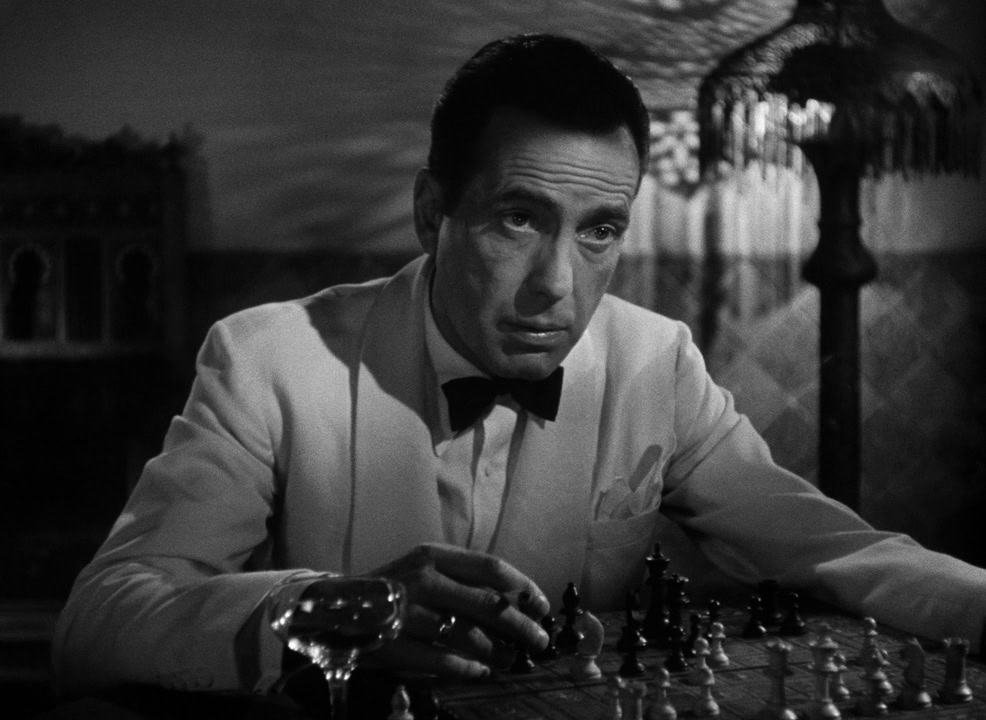
The Academy Ratio era showcased some of the most iconic works of early sound cinema, from the lavish musicals of Busby Berkeley to the thrilling swashbucklers of Errol Flynn. Directors like Howard Hawks and John Ford used the tall frame to create a sense of verticality and grandeur, filling the screen with towering western vistas or crowded urban landscapes. The square-ish proportions also suited the staged, theatrical style of early sound films, creating an intimate bond between viewer and performer.
However, as film styles evolved and became more fluid and naturalistic in the 1940s, the limitations of the Academy frame started to chafe. Directors yearned to break free of the boxed-in compositions and show a wider, more realistic view of the world – a desire that would lead to a widescreen revolution in the 1950s.
The Rise of Widescreen and CinemaScope
The 1950s saw a seismic shift in aspect ratios with the introduction of widescreen formats. This was a direct response to the perceived threat of television, which was stealing audiences away with its free content and in-home convenience. Hollywood, in an effort to differentiate the theatrical experience, sought to offer something television’s small 4:3 screens couldn’t match: a bigger, wider, more engulfing visual spectacle.
The first major widescreen process was Cinerama, which used three synchronized 35mm cameras to record a vast, curved image onto a gigantic, deeply concave screen. This created an immersive experience that wowed audiences with its sheer scale, but was impractical for narrative filmmaking due to the expense and technical challenges of the setup.
A more feasible solution arrived with CinemaScope, a process developed by 20th Century Fox that used special anamorphic lenses to compress a wide image onto standard 35mm film. This allowed for a 2.35:1 aspect ratio, nearly twice as wide as the Academy frame, without requiring changes to cameras, film stock, or projection equipment. The anamorphic image was then expanded back to its original width in the projector, filling a vast, curved screen.

CinemaScope made its debut with the biblical epic The Robe in 1953, and quickly became a sensation. The wider frame allowed for grand, sweeping compositions that immersed the viewer in the landscape and action. It was perfectly suited for the epic, exotica, and spectacle that defined 1950s cinema, from the panoramic desert vistas of Lawrence of Arabia to the chariot races of Ben-Hur.
Other studios quickly developed their own widescreen processes, such as Paramount’s VistaVision and MGM’s Panavision, each with slightly different aspect ratios and technical approaches. By the end of the decade, widescreen had become the new standard, with the old Academy Ratio used mainly for lower-budget films and television.
The widescreen aesthetic brought a new visual dynamism to cinema. Directors could stage complex scenes with multiple points of interest, using the full width of the frame for layered compositions. The expansive horizontal space created a sense of cinematic “breathing room,” allowing for naturalistic staging and camera movement. Close-ups became even more impactful when contrasted against the vast negative space of the wide frame.
However, widescreen also presented challenges. Early anamorphic lenses could distort close-ups or produce visible “anamorphic mumps.” The wider frame made it more difficult to maintain visual interest and coherence, requiring careful composition and staging. And some directors, accustomed to the intimacy of the Academy frame, struggled to adapt to the new format.
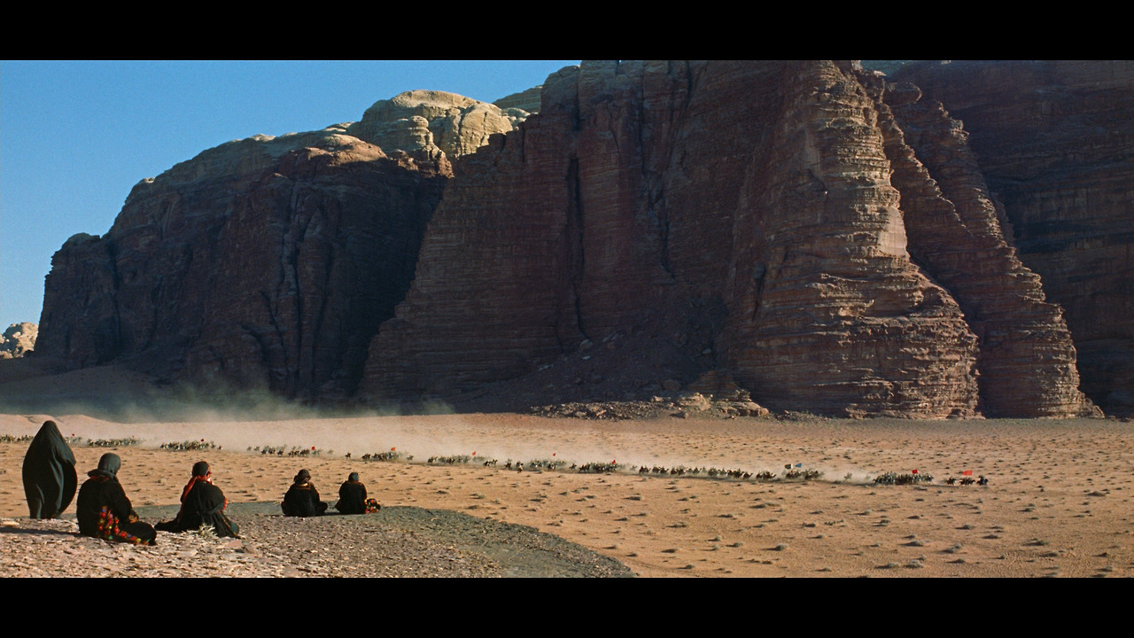
Nonetheless, widescreen became the canvas for some of the most ambitious and influential films of the 1960s and 70s. Stanley Kubrick exploited the ultra-wide 2.2:1 ratio of Super Panavision 70 for the mind-bending visuals of 2001: A Space Odyssey. David Lean turned the vast 2.20:1 frame of Lawrence of Arabia into a meditation on the insignificance of man against the expanse of the desert. And George Lucas used the 2.35:1 anamorphic frame to create the immersive space fantasy of Star Wars, setting the template for the modern blockbuster.
The Modern Era: 16:9 and Digital Ratios
As television sets grew in size and adopted a wider format in the 1990s, a new aspect ratio came to prominence: 16:9, or about 1.78:1. This was first used for high-definition television broadcasts, and soon became the standard for DVDs and then Blu-rays. Many modern films are shot in a 1.85:1 ratio, which fits the 16:9 frame comfortably while still providing a slightly wider, more cinematic feel compared to HDTV.
![The Matrix – [FILMGRAB]](https://film-grab.com/wp-content/uploads/2017/02/thematrix041.jpg)
The rise of digital cinematography in the 2000s brought even more flexibility to aspect ratios. Without the constraints of physical film stock, directors could choose from a wide variety of frame sizes and shapes, from square to ultra-widescreen. Some filmmakers have even started switching aspect ratios within a single film for creative effect – a technique that would have been nearly impossible in the analog era.
For instance, Wes Anderson’s The Grand Budapest Hotel uses three different ratios (1.37, 1.85, and 2.35:1) to represent different time periods in the story, each with its own distinct visual feel. Christopher Nolan’s The Dark Knight and Interstellar switch between standard widescreen and the taller IMAX format (1.43:1 or 1.90:1) for select scenes, creating a sense of expanded scale and immersion.

This new freedom has led to a resurgence of experimentation with non-standard aspect ratios. Some directors have returned to the square-ish frames of early cinema for a retro, nostalgic effect (as in The Artist or A Ghost Story), while others have pushed widescreen to new extremes with anamorphic lenses and ultra-wide formats like the 2.76:1 Ultra Panavision 70 of The Hateful Eight.
However, with this freedom also comes the challenge of maintaining visual coherence across different viewing platforms. A film shot in 2.35:1 may look grand in a theater but cramped on a 16:9 TV or laptop screen. As audiences consume media on an ever-widening array of devices, filmmakers must be mindful of how their chosen aspect ratio will translate across formats.
Despite these challenges, aspect ratio remains a powerful tool in the modern filmmaker’s arsenal. Whether used for stylistic effect, genre conventions, or thematic resonance, the choice of frame size and shape profoundly influences how we experience and interpret the moving image. As we’ll explore in the next section, these choices are far from purely aesthetic – they have deep psychological and emotional implications for the viewer.
Part 2: The Psychology of Aspect Ratios
The Neuroscience of Visual Perception
To understand how aspect ratios affect us psychologically, we must first delve into the neuroscience of visual perception. Our eyes and brain process visual information in complex ways that can be exploited or challenged by different frame sizes and shapes.
One key concept is that of peripheral vision. While we typically think of our vision as a single, uniform field, in reality our visual perception is highly divided. The center of our gaze, known as foveal vision, is where we see sharp, colorful detail. This makes up only a small portion of our total visual field.
The rest is peripheral vision – a much broader but less detailed field of view that extends nearly 180 degrees. This peripheral vision is crucial for spatial awareness, motion detection, and visual context. It’s also highly attuned to changes in light and contrast, which can trigger instinctive responses like the fight-or-flight reflex.
Different aspect ratios engage our peripheral vision in different ways. The wider the frame, the more information is spilling into our periphery, creating a sense of immersion or even slight unease. This is why horror films often use wide frames and anamorphic lenses to create a sense of looming menace just outside our focus.
On the flip side, taller, narrower frames exclude peripheral information, focusing our gaze and blocking out distractions. This can create a sense of intimacy, claustrophobia, or isolation, as in the 1.37:1 close-ups of Son of Saul that trap us in the protagonist’s haunted, hunted perspective.

Another key concept is that of binocular vision. Our two eyes see slightly different images, which our brain combines into a single 3D picture. This process, called stereopsis, is what gives us depth perception and allows us to judge distances.
However, this 3D effect only works within a certain range of distances, beyond which our eyes effectively see a flat image. This is why ultra-wide shots in 70mm or IMAX formats can look uncannily flat and postcard-like – they exceed the range of our natural depth perception.
Filmmakers can exploit this by using different lenses and camera distances to manipulate apparent depth and volume. Wide-angle lenses exaggerate depth and make spaces feel larger, while telephoto lenses compress depth and make distant objects feel close, or even claustrophobic.
When combined with different aspect ratios, these lens effects can radically alter our perception of cinematic space. The wide angles and deep focus of Citizen Kane’s 1.37:1 shots create a sense of cavernous, looming environments, while the telephoto and shallow focus of The Graduate’s 1.85:1 close-ups create a flattened, pressurized intimacy.

The famous “Vertigo effect” shot, invented by Hitchcock and his cinematographer Robert Burks, combines a dolly zoom with the anamorphic squeeze of the 1.85:1 frame to create a dizzying, unnatural distortion of space that mirrors the protagonist’s disorientation and anxiety.
The Psychology of Framing and Composition
Beyond the raw neuroscience of perception, aspect ratios also shape the psychology of how we read and interpret the frame. The composition and staging of elements within different frame shapes can radically alter their emotional and narrative impact.
In the narrower Academy Ratio frame, for instance, filmmakers often relied on centered, symmetrical compositions that place the key action or character in the middle of the frame. This creates a stable, focused composition that draws the eye inward and emphasizes the singularity of the subject.
Think of the iconic final shot of The 400 Blows, with its young protagonist trapped in the center of a square 1.37:1 frame, staring uncertainly at the camera and the audience. The tight framing and central composition underscore his isolation, vulnerability, and ambiguous fate.
Wider aspect ratios, by contrast, allow for more complex and decentered compositions. Directors can stage actions at different depths and in different parts of the frame, creating a sense of layered, multi-planar space. This can emphasize relationships, contrasts, or thematic parallels between elements.
A master of this technique was Sergio Leone, who used the extreme width of his 2.35:1 frames to stage operatic showdowns and confrontations. In the famous graveyard scene in The Good, The Bad, and The Ugly, Leone composes his three gunslingers in a triangle across the vast expanse of the widescreen frame, their spatial positions mirroring the shifting alliances and tensions between them.
Aspect ratio also shapes the sense of balance and dynamism in the frame. In a 1.37:1 frame, the image is naturally balanced vertically, with equal space above and below the horizon line. This can create a sense of stability, symmetry, or stasis, as in the table-top compositions of Yasujiro Ozu’s domestic dramas.
In a widescreen frame, however, the image is weighted horizontally, with more lateral negative space. This can create a sense of imbalance or movement, as the eye naturally wants to move across the wider field of the frame. This is why widescreen is so well-suited for action, chases, and lateral motion – the aspect ratio itself encourages a sense of dynamism and speed.
The psychological power of different frame shapes is so strong that even the tiniest shift in ratio can radically alter the feel of a film. When Sam Mendes shot the James Bond film Skyfall, he chose to use a slightly taller 2.40:1 ratio instead of the standard 2.35:1, subtly evoking the franchise’s early films and giving the images a hint of retro edge and vertical grandeur.
The Phenomenology of Cinematic Space
At a deeper level, aspect ratios shape the very way we experience and inhabit cinematic space. Different frame sizes and shapes create different phenomenological relationships between the viewer and the viewed, influencing our sense of scale, distance, and involvement with the action onscreen.
The tight 1.37:1 frames of early cinema, for instance, create a sense of theatrical intimacy, as if we are peeking through a window or porthole into the world of the film. This can create a sense of voyeuristic detachment, as we observe the action from a fixed, frontal perspective.
The widescreen frames of the 1950s and 60s, by contrast, create a sense of expansive immersion, as if we are enveloped by the world of the film. The wide field of view fills our peripheral vision, creating a sense of presence and participation in the onscreen space.
Think of the famous “stargate” sequence in 2001: A Space Odyssey, where the widescreen frame stretches and distorts to fill our entire visual field, creating a visceral sense of transcendence and transportation. Or the famous “baptism” scene in The Godfather, where the wide frame immerses us in the rich, shadowy world of the church while also isolating Michael Corleone in a pool of cold, empty space.

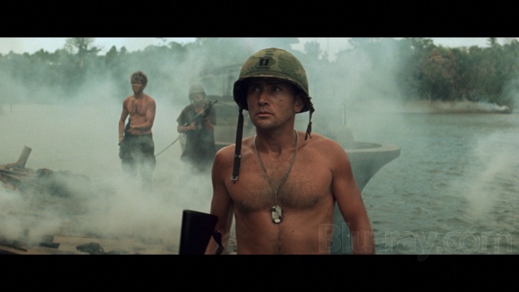
Different aspect ratios also shape our sense of scale and proportion. Taller frames can create a sense of vertical grandeur or monumentality, as in the looming 1.37:1 close-ups of Marlon Brando in Apocalypse Now. Wider frames can create a sense of horizontal vastness or scope, as in the epic 2.20:1 landscapes of Lawrence of Arabia.
When combined with camera angles and movement, aspect ratios can even shape our sense of subjectivity and identification with characters. In a famous shot from Hitchcock’s Vertigo, the camera dollies in on Jimmy Stewart’s face while simultaneously zooming out, creating a dizzying, destabilizing effect that mirrors his character’s acrophobia and disorientation.
In the climactic battle of Saving Private Ryan, Spielberg uses the immersive 1.85:1 frame to plunge us into the chaos and terror of combat, with the camera darting and weaving through the carnage like a panicked soldier. The widescreen frame fills our vision with explosions, debris, and hurtling bodies, creating a visceral sense of danger and immersion.
Part 3: Aspect as Auteur – Case Studies in Visual Style
Orson Welles and the Power of the 1.37:1 Frame
Orson Welles, the enfant terrible of Hollywood’s Golden Age, was a master of the 1.37:1 Academy Ratio. He used its boxy, vertical proportions to create images of towering depth and psychological intensity, transforming the “standard” frame into a canvas for visual and emotional expressionism.
In his debut film Citizen Kane (1941), Welles and cinematographer Gregg Toland pushed the boundaries of what was possible in the 1.37:1 frame. They used wide-angle lenses, deep focus photography, and low camera angles to create compositions of staggering depth and complexity, with ceilings looming overhead and floors stretching into the distance.
The film’s famous “breakfast montage” sequence shows the disintegration of Kane’s marriage through a series of vignettes staged across the deep space of the 1.37:1 frame. As the couple grows further apart emotionally, Welles places them further apart in depth, their figures dwarfed by the cavernous emptiness of their mansion. The tight Academy Ratio frame becomes a pressure cooker for their mounting resentments and loneliness.
Welles continued to exploit the expressive potential of the 1.37:1 frame in his later films. In The Magnificent Ambersons (1942), he used the tall, narrow frame to create a sense of Victorian stuffiness and confinement, trapping his characters in airless, ornate interiors. In Touch of Evil (1958), he used the frame’s vertical lines to create a sense of moral claustrophobia and corruption, with characters boxed in by looming walls and long shadows.
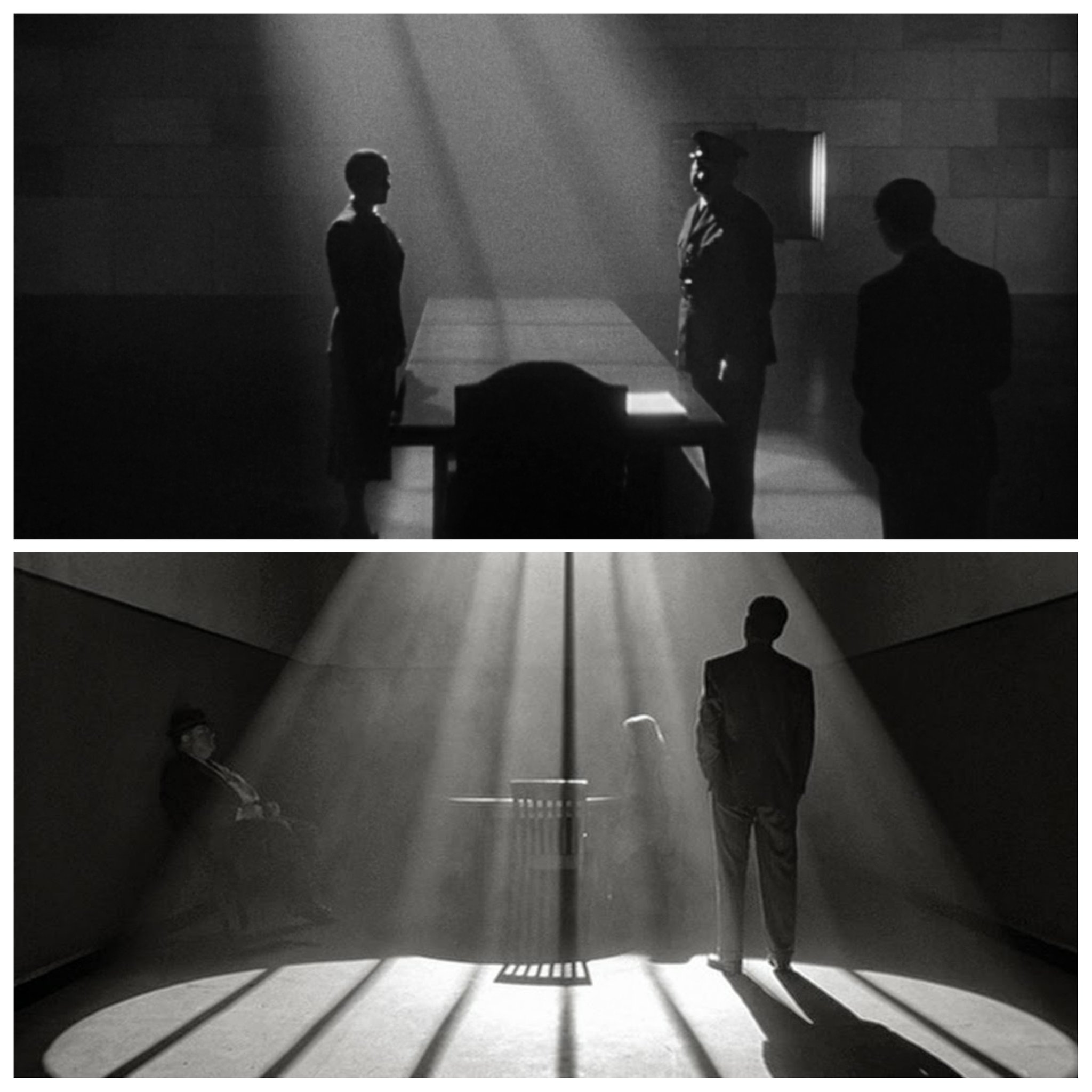
Even when working in color and widescreen, Welles found ways to evoke the psychological intensity of his early 1.37:1 films. In Chimes at Midnight (1965), he used the 1.66:1 frame to create a sense of medieval squalor and congestion, with Falstaff’s bulbous figure squeezed into overcrowded taverns and battlefields. The film’s famous Battle of Shrewsbury sequence is a tour de force of widescreen composition, using the elongated frame to convey the chaos and brutality of hand-to-hand combat.
Through his masterful use of the 1.37:1 frame and its aspect ratio descendants, Welles showed how even the most “basic” frame could be transformed into a tool of immense visual and psychological power. He paved the way for later generations of filmmakers to explore the expressive potential of frame size and shape.
Akira Kurosawa and the Dynamism of the 2.35:1 Frame
If Welles was the master of the Academy Ratio, then Akira Kurosawa was the samurai of the anamorphic widescreen frame. The Japanese auteur was one of the first filmmakers to embrace the 2.35:1 CinemaScope format, using its wide horizontal canvas to create images of startling dynamism and kinetic energy.
Kurosawa’s breakthrough film Rashomon (1950) was shot in the Academy Ratio, but already showed his mastery of composition and camera movement. With its famous “forest” sequence, where the camera glides through the dappled sunlight and shifting leaves, Kurosawa created a sense of mystery and ambiguity that mirrored the film’s theme of subjective truth.
But it was with his first widescreen film, Seven Samurai (1954), that Kurosawa truly exploited the potential of the anamorphic frame. The film’s epic battle sequences are marvels of widescreen staging and cinematography, with Kurosawa using the elongated horizontal frame to convey the chaos and frenzy of the sword fights.

In one famous shot, Kurosawa tracks his camera through a sea of clashing bodies and flashing blades, the widescreen frame barely able to contain the sheer kinetic energy of the scene. The aspect ratio becomes a metaphor for the boundless, uncontainable violence of the moment.
Kurosawa continued to push the boundaries of widescreen composition in his later samurai films and action epics. In Yojimbo (1961), he used the 2.35:1 frame to create a sense of tense, electric anticipation in the film’s famous showdown scenes, with the wide expanses of the town’s empty streets stretched out on either side of the solitary ronin.
In Ran (1985), his late-career masterpiece, Kurosawa used the widescreen frame to stage massive battle sequences with hundreds of extras, creating a sense of epic scale and grandeur. But he also used the frame’s elongated proportions to convey the isolation and madness of his Lear-like protagonist, with the old warlord often framed as a tiny, tottering figure against the vast, empty landscapes.
Through his dynamic, muscular use of the 2.35:1 frame, Kurosawa showed how widescreen could be used not just for spectacle and scope, but for intimate character study and psychological expression. He influenced a generation of action filmmakers, from Sergio Leone to John Woo, who would use the widescreen frame to create their own brand of balletic, operatic violence.
Ingmar Bergman and the Intimacy of the 1.37:1 Frame
While Kurosawa was using the widescreen frame to create images of epic scale and action, Swedish auteur Ingmar Bergman was using the narrower 1.37:1 frame to plumb the depths of the human soul. Bergman, who began his career in the early 1950s, was one of the last major filmmakers to work primarily in the Academy Ratio, using its boxy proportions to create images of searing intimacy and psychological intensity.
![The Seventh Seal – [FILMGRAB]](https://film-grab.com/wp-content/uploads/photo-gallery/04%20(984).jpg?bwg=1547413393)
Bergman’s breakthrough film, Summer with Monika (1953), was shot in the Academy Ratio and established his signature style of close-ups and two-shots. The film’s famous final shot, a long take of Monika’s face as she stares directly into the camera, is a masterpiece of 1.37:1 framing, using the tight proportions to create a sense of confrontational intimacy with the character.
Bergman continued to explore the psychological potential of the 1.37:1 frame in his chamber dramas of the 1950s and 60s. In The Seventh Seal (1957), he used the tall, narrow frame to create a sense of spiritual claustrophobia, with Max von Sydow’s knight often framed against the blank, overcast sky like a figure in a medieval painting.
In Persona (1966), Bergman pushed the boundaries of what was possible in the 1.37:1 frame, using extreme close-ups, fragmented compositions, and surreal imagery to convey the mental breakdown of his actress protagonist. The film’s famous “merged faces” shot, where the faces of the two lead actresses are split and blended together in a single frame, is a tour de force of psychological 1.37:1 framing.
Even when he began working in widescreen in the late 1960s, Bergman found ways to evoke the intimacy and intensity of his earlier 1.37:1 films. In Cries and Whispers (1972), he used the 1.66:1 frame to create a sense of dreamlike claustrophobia, with the characters often framed against the blood-red walls of their childhood home. In Scenes from a Marriage (1973), he used the 1.37:1 frame for the film’s television version, creating a sense of domestic intimacy and confinement.
Through his use of the 1.37:1 frame and its aspect ratio descendants, Bergman showed how even the most “standard” frame could be transformed into a tool of immense psychological power. He influenced generations of filmmakers, from Woody Allen to Andrei Tarkovsky, who would use the Academy Ratio and other narrow frames to explore the inner lives of their characters.
Part 4: Aspect Ratio and Genre
Beyond the auteur theory, aspect ratio has also been used to define and shape entire genres throughout film history. Different genres have gravitated towards different frame shapes and sizes, using the unique properties of each to create distinct visual and emotional experiences.
Westerns and the Myth of the American Frontier
The Western genre, with its iconography of vast desert landscapes, rugged cowboys, and tense gunfights, has long been associated with the widescreen frame. From the early CinemaScope epics of the 1950s to the revisionist masterpieces of the 1960s and 70s, the Western has used the elongated horizontal frame to evoke the mythic expanse of the American frontier.
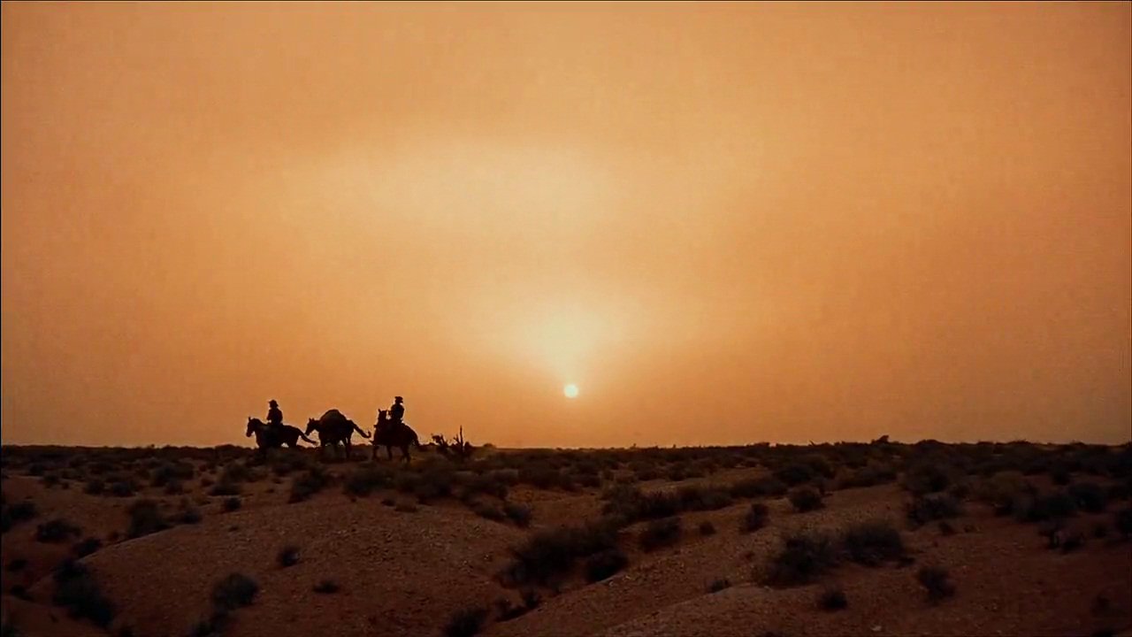
John Ford, the genre’s most influential director, was one of the first to exploit the potential of widescreen in his landmark film The Searchers (1956). Shot in the early CinemaScope process known as VistaVision, the film used the wide 1.85:1 frame to create iconic images of John Wayne’s Ethan Edwards silhouetted against the sweeping vistas of Monument Valley.
The film’s famous final shot, with Ethan framed in the darkened doorway of his family’s homestead, is a masterpiece of widescreen composition, using the frame’s elongated proportions to convey the character’s isolation and uncertain future. The shot has been endlessly homaged and parodied, from George Lucas’s Star Wars to Mel Brooks’s Blazing Saddles.
Sergio Leone, the Italian director who revolutionized the Western in the 1960s, used the even wider 2.35:1 frame to create his own brand of mythic, operatic action. In films like The Good, The Bad, and The Ugly (1966) and Once Upon a Time in the West (1968), Leone staged his showdowns and shootouts in vast, empty landscapes, using the widescreen frame to dwarf his characters against the epic expanse of the desert.
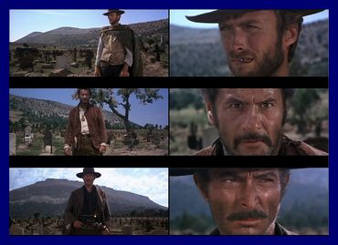
Leone’s famous “triello” or three-way standoff shots, with the characters arranged in a triangle across the 2.35:1 frame, became a defining image of the Spaghetti Western subgenre. The extreme width of the frame allowed Leone to place his characters at opposite ends of the screen, creating a sense of tense, almost abstract space between them.
In the 1970s, directors like Sam Peckinpah and Arthur Penn used the widescreen frame to deconstruct the mythic iconography of the Western, staging bloody, chaotic action sequences that pushed the boundaries of cinema violence. In Peckinpah’s The Wild Bunch (1969) and Pat Garrett & Billy The Kid (1973), the 2.35:1 frame becomes a canvas for balletic, slow-motion carnage, with bodies and bullets ripping across the elongated screen.
Even as the Western genre has waned in popularity, contemporary filmmakers have continued to use the widescreen frame to evoke its mythic expanse and visual grandeur. The Coen Brothers’ No Country for Old Men (2007), with its sweeping Texas vistas and terse, tense dialogue scenes, and Paul Thomas Anderson’s There Will Be Blood (2007), with its bravura opening sequence of a lone prospector in the California desert, both use the 2.35:1 frame to create a sense of epic scale and psychological isolation, in the grand tradition of Ford and Leone.
Film Noir and the Shadows of the 1.37:1 Frame
While the Western genre has long been associated with the widescreen frame, the shadowy, morally ambiguous world of film noir has often been expressed through the narrower confines of the Academy Ratio. With its emphasis on urban claustrophobia, subjective psychology, and expressionistic lighting, noir has used the 1.37:1 frame to create a sense of entrapment and inner turmoil.
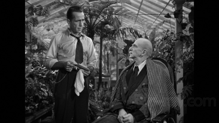
In classic noirs of the 1940s and 50s like Double Indemnity (1944), The Big Sleep (1946), and The Third Man (1949), the boxy proportions of the Academy Ratio frame are used to create compositions of deep, receding space, with characters often trapped in the middle distance by looming shadows and low-key lighting. The tall, narrow frame emphasizes vertical lines and shapes, creating a sense of oppressive height and depth.
Orson Welles, with his background in German Expressionist theater, was a master of using the 1.37:1 frame for noirish effect. In The Lady from Shanghai (1947), he used extreme low angles and deep focus compositions to create a sense of disorientation and paranoia, with ceilings looming overhead and floors stretching into the abyss. The film’s famous hall of mirrors climax is a tour de force of 1.37:1 framing, with Welles using the tight, boxy frame to create a dizzying kaleidoscope of fractured, multiplying images.
In the 1950s, as widescreen processes became more popular, some filmmakers began to experiment with using the elongated frame for noirish effect. Otto Preminger’s Carmen Jones (1954) and Anatole Litvak’s The Deep Blue Sea (1955) both used the CinemaScope frame to create a sense of widescreen claustrophobia, with characters trapped in the middle of the elongated screen by encroaching shadows and empty space.
However, the taller, narrower frames of Academy Ratio and 1.66:1 have remained the go-to aspect ratios for noir, even into the neo-noir era of the 1970s and beyond. In Roman Polanski’s Chinatown (1974), shot in 1.85:1, the slightly taller frame is used to create a sense of vertical tension and unease, with Jack Nicholson’s Jake Gittes often framed against the looming art deco architecture of 1930s Los Angeles.

In Joel and Ethan Coen’s The Man Who Wasn’t There (2001), shot in luscious black-and-white scope, the 1.85:1 frame is used to evoke the existential alienation and empty spaces of small-town California, with Billy Bob Thornton’s barber protagonist often lost in the middle distance of the elongated screen.
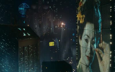
Even in color neo-noirs like Blade Runner (1982) and Se7en (1995), the 2.35:1 frame is used to create a sense of future-noir dread and decay, with characters dwarfed by the towering, rain-soaked architecture of dystopian cityscapes. The wide frame becomes a canvas for expressionistic color and light, with neon signs and fluorescent tubes slashing across the screen like jagged wounds.
Science Fiction and the Expanse of Outer Space
Science fiction cinema has long been associated with the widescreen frame, using its extended horizontal expanse to evoke the vastness of outer space and the futuristic vistas of imagined worlds. From the early CinemaScope spectacles of the 1950s to the CGI-enhanced blockbusters of today, the genre has used the elongated frame to create a sense of awe and wonder at the cosmic unknown.
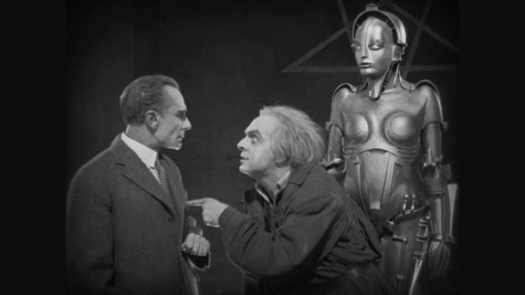
One of the earliest and most influential science fiction films, Fritz Lang’s Metropolis (1927), used the Academy Ratio frame to create a sense of towering verticality and oppressive height, with the futuristic city’s skyscrapers looming over the worker drones below. However, as widescreen processes became more popular in the 1950s, science fiction films began to exploit the potential of the elongated frame to create vistas of alien landscapes and high-tech machinery.
Forbidden Planet (1956), one of the first science fiction films shot in CinemaScope, used the wide frame to showcase its elaborate sets and special effects, with the characters often dwarfed by the towering machinery of the alien world. The film’s famous monster, the “Id Monster,” is a triumph of widescreen composition, with its pulsating, semi-transparent form filling the elongated screen in a series of dramatic close-ups.
Stanley Kubrick’s 2001: A Space Odyssey (1968), shot in the ultra-wide Super Panavision 70 format, pushed the boundaries of what was possible in the science fiction genre. Kubrick used the 2.20:1 frame to create images of staggering scale and symmetry, with the characters often engulfed by the vast expanse of outer space or the gleaming white surfaces of high-tech interiors.
The film’s famous “Star Gate” sequence, a hallucinatory journey through swirling colors and abstract shapes, is a tour de force of widescreen cinematography, with Kubrick using the elongated frame to create a sense of disorienting, transcendent movement through space and time. The sequence has influenced countless science fiction films since, from Close Encounters of the Third Kind (1977) to The Tree of Life (2011).
George Lucas’s Star Wars (1977) and Ridley Scott’s Alien (1979) both used the anamorphic widescreen frame to create their own brand of immersive, futuristic world-building. Lucas used the 2.35:1 frame to showcase his elaborate spaceship designs and alien landscapes, with the widescreen format becoming a key part of the Star Wars franchise’s visual identity.
Scott, on the other hand, used the widescreen frame to create a sense of claustrophobic horror, with the crew of the Nostromo often trapped in the tight, labyrinthine corridors of their ship, stalked by the barely-glimpsed xenomorph. The film’s famous chestburster scene is a masterpiece of widescreen terror, with the creature bursting out of John Hurt’s torso and into the horrified faces of the audience, all within the relentless horizontal expanse of the 2.35:1 frame.
In the 1980s and 90s, science fiction films began to experiment with using different aspect ratios within the same film to evoke different time periods or levels of reality. In The Abyss (1989), James Cameron used the 2.35:1 frame for the film’s underwater sequences, creating a sense of claustrophobic tension and isolation, while using the taller 1.85:1 frame for the scenes on the surface, evoking a sense of normalcy and openness.
In The Matrix (1999), the Wachowskis used the 2.35:1 frame for the film’s iconic “bullet time” sequences, creating a sense of hyper-kinetic, ultra-slow-motion action, while using the taller 1.85:1 frame for the scenes set within the Matrix itself, evoking the boxy confines of the simulated reality.
In recent years, science fiction films have continued to push the boundaries of what is possible with the widescreen frame. In Gravity (2013), Alfonso Cuarón used the 2.35:1 frame and elaborate long takes to create a sense of disorienting, zero-gravity movement through space, with Sandra Bullock’s astronaut tumbling and spinning through the void in a series of dizzying, unbroken shots.
In Interstellar (2014), Christopher Nolan used the ultra-wide IMAX format to create images of staggering scale and grandeur, with the characters dwarfed by the vast expanse of space and the towering tidal waves of alien planets. Nolan alternated between the taller IMAX frame and the more conventional 2.35:1 aspect ratio to evoke the difference between the infinite vastness of space and the cramped confines of the characters’ spaceships.
Horror and the Dread of the Unseen
While science fiction has often used the widescreen frame to evoke a sense of awe and wonder at the vastness of the universe, horror films have exploited the unique properties of different aspect ratios to create a sense of dread, claustrophobia, and lurking menace.
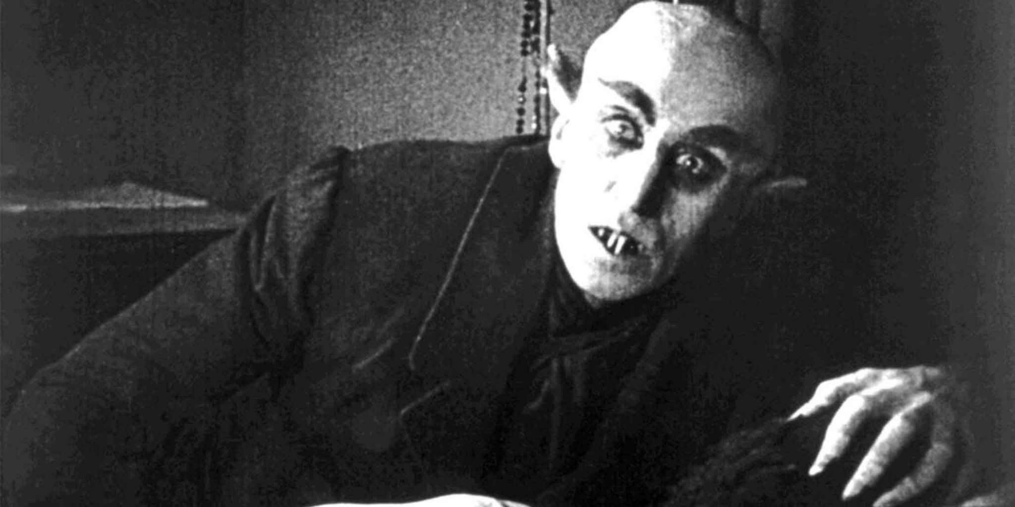
In the early days of cinema, horror films were often shot in the boxy confines of the Academy Ratio, using the tall, narrow frame to create a sense of oppressive height and depth. In films like Nosferatu (1922) and The Cabinet of Dr. Caligari (1920), the expressionistic sets and lighting of German Expressionism were used to create a sense of unease and disorientation, with the characters often dwarfed by the looming, distorted architecture of the frame.
As Hollywood horror films became more popular in the 1930s and 40s, directors began to use the Academy Ratio frame to create a sense of gothic atmosphere and creeping dread. In films like Dracula (1931) and Cat People (1942), the tall, narrow frame was used to create compositions of deep, receding space, with characters often framed in the middle distance, surrounded by pools of inky black shadow.

In Alfred Hitchcock’s Psycho (1960), the Academy Ratio frame was used to create a sense of voyeuristic unease and claustrophobic tension. In the film’s famous shower scene, Hitchcock used the tight, boxy frame to create a sense of shocking intimacy and violence, with Janet Leigh’s Marion Crane trapped in the narrow confines of the shower, assaulted by the unseen killer.
As widescreen formats became more popular in the 1950s and 60s, horror filmmakers began to experiment with using the elongated frame to create a sense of empty space and lurking menace. In Roman Polanski’s Rosemary’s Baby (1968), the 2.35:1 frame was used to create a sense of isolation and vulnerability, with Mia Farrow’s Rosemary often framed as a small, fragile figure against the yawning expanse of her apartment building’s sinister corridors.

In John Carpenter’s Halloween (1978), the 2.35:1 frame was used to create a sense of stalking, predatory menace, with the masked killer Michael Myers often lurking in the shadows at the edges of the screen, waiting to pounce on his unsuspecting victims. Carpenter’s use of the widescreen frame to evoke a sense of off-screen space and creeping dread has influenced countless slasher films since.
In more recent horror films, directors have continued to experiment with using different aspect ratios to create a sense of unease and disorientation. In The Blair Witch Project (1999), the jittery, handheld 1.33:1 frame of the characters’ camcorder footage was used to create a sense of raw, unmediated terror, with the tight, boxy frame evoking the claustrophobic panic of being lost in the woods.
In It Follows (2014), director David Robert Mitchell used the 2.35:1 frame to create a sense of wide-open, inescapable space, with the film’s malevolent entity often stalking the characters from the distant edges of the screen, its slow, implacable approach evoking a sense of mounting dread.
And in The Lighthouse (2019), director Robert Eggers used the boxy, nearly-square 1.19:1 frame to create a sense of claustrophobic madness and psychological breakdown, with the film’s two characters trapped in the cramped confines of a remote lighthouse, their sanity slowly unraveling within the tight, oppressive frame.
Part 5: The Future of Aspect Ratios
As we have seen, the history of cinema is in many ways the history of the evolving relationship between the frame and the audience. From the early days of the Academy Ratio to the widescreen revolution of the 1950s and beyond, filmmakers have used the shape and size of the frame as a key tool for shaping the viewer’s emotional and psychological experience of the film.
However, in recent years, the rise of digital streaming and mobile viewing has begun to challenge the traditional notions of aspect ratio and the primacy of the theatrical experience. With viewers increasingly watching films on a variety of screens and devices, from smartphones to tablets to ultra-widescreen TVs, the question of how to compose and frame images for maximum impact has become more complex and multifaceted.
Some filmmakers have embraced the new possibilities of the digital era, experimenting with using different aspect ratios and frame sizes within the same film to evoke different moods, time periods, or levels of reality. In The Grand Budapest Hotel (2014), Wes Anderson used three different aspect ratios (1.37:1, 1.85:1, and 2.35:1) to distinguish between the film’s different historical eras, with each frame size evoking a different set of cinematic and cultural references.
Other filmmakers have pushed back against the trend towards smaller, more intimate screens, using the massive scale and resolution of IMAX cameras and projectors to create immersive, enveloping visual experiences that can only be fully appreciated in a theatrical setting. Christopher Nolan, in particular, has been a vocal advocate for the IMAX format, using it to create stunning, large-format sequences in films like The Dark Knight (2008), Interstellar (2014), and Dunkirk (2017).

At the same time, the rise of virtual reality and augmented reality technologies has begun to hint at new possibilities for immersive, interactive storytelling that transcend the traditional boundaries of the rectangular frame. In VR experiences like Dear Angelica (2017) and Spheres (2018), the viewer is no longer a passive observer of the action, but an active participant in a 360-degree environment, able to look and move in any direction.
While these experiences are still in their infancy, they suggest a future in which the very notion of the frame as a fixed, predetermined window onto a cinematic world may become increasingly fluid and malleable. As filmmakers continue to experiment with new technologies and storytelling techniques, the relationship between the viewer and the screen may become more interactive, more immersive, and more personalized.

However, even as the boundaries of the frame continue to shift and evolve, the fundamental psychological power of composition, aspect ratio, and visual storytelling remains as potent as ever. Whether viewed on a massive IMAX screen or a tiny smartphone, the ability of the moving image to shape our emotions, perceptions, and sense of self remains one of the great wonders and mysteries of the cinematic art form.
As we move into this new era of cinematic storytelling, it is more important than ever to understand and appreciate the long history and complex psychology of the film frame. By studying the ways in which filmmakers have used aspect ratio and composition to shape the viewer’s experience, we can gain a deeper appreciation for the art and craft of cinema, and a greater understanding of the ways in which the moving image shapes our understanding of ourselves and the world around us.
In the end, the story of aspect ratio is the story of the evolving relationship between the filmmaker, the film, and the audience. It is a story of innovation, experimentation, and creative vision, of the endless quest to find new ways to capture and convey the richness, complexity, and beauty of the human experience. As we move into the future of cinema, let us continue to explore and push the boundaries of what is possible within the frame, while never losing sight of the enduring power and magic of the movies.
Works Cited
- Bazin, André. What Is Cinema? Vol. 1. University of California Press, 2004.
- Belton, John. Widescreen Cinema. Harvard University Press, 1992.
- Bordwell, David. On the History of Film Style. Harvard University Press, 1997.
- Cossar, Harper. Letterboxed: The Evolution of Widescreen Cinema. University Press of Kentucky, 2011.
- Ebert, Roger. “The World on a Wide Screen.” Smithsonian Magazine, May 1999.
- Eisenstein, Sergei. The Film Sense. Edited by Jay Leyda. Harcourt Brace Jovanovich, 1975.
- Finler, Joel W. The Hollywood Story. Wallflower Press, 2003.
- Gomery, Douglas. Shared Pleasures: A History of Movie Presentation in the United States. University of Wisconsin Press, 1992.
- Hall, Sheldon, and Steve Neale. Epics, Spectacles, and Blockbusters: A Hollywood History. Wayne State University Press, 2010.
- Horrocks, Roger. “The Scope of Widescreen.” Cinegrafie, no. 16, 2003, pp. 273-285.
- Jones, Nick. “The Persistence of the Widescreen Aesthetic.” American Cinematographer, vol. 82, no. 12, Dec. 2001, pp. 58-63.
- Katz, Steven D. Film Directing Shot by Shot: Visualizing from Concept to Screen. Michael Wiese Productions, 1991.
- Keating, Patrick. “The Widescreen Revolution and Other Myths About Changes in Hollywood Cinema.” Journal of Film and Video, vol. 62, no. 3, 2010, pp. 3-17.
- Miller, Mark. “From Traditional to Contemporary: Changing Aspect Ratios in Recent Films.” American Cinematographer, vol. 99, no. 1, Jan. 2018, pp. 30-39.
- Mitchell, Rick. “The Big Squeeze: Mastering Anamorphic Widescreen.” In70mm.com, 2001.
- Monaco, James. How to Read a Film: Movies, Media, and Beyond. Oxford University Press, 2009.
- Rogers, Ariel. Cinematic Appeals: The Experience of New Movie Technologies. Columbia University Press, 2013.
- Salt, Barry. Film Style and Technology: History and Analysis. Starword, 2009.
- Scorsese, Martin, and Michael Henry Wilson. A Personal Journey with Martin Scorsese Through American Movies. Miramax Books/Hyperion, 1997.
- Weissberg, Jay. “The Sound of One Wing Flapping.” Sight and Sound, vol. 23, no. 11, Nov. 2013, pp. 38-41.

















0 Comments