The Psychology of Design: How Our Spaces Reveal Our Minds

by | Aug 13, 2024 | 0 comments


The Psychology of Design in America

Design is more than just the way things look. Design is an alchemization  of a culture’s values, aspirations, anxieties and worldview at a particular moment in time. Like an anthropologist studying ancient ruins to understand a lost civilization, we can examine the designs of past eras to gain insight into the psyche of the society that created them. Every curve of a 1950s tail fin, every earthtone in a 1970s living room, every boxy black appliance of the 1980s was shaped by powerful social, economic and psychological forces bubbling beneath the surface.

From a depth psychology perspective, design is a window into the collective unconscious – a way to visualize the unspoken fears, desires and neuroses shared by a population. Just as our dreams contain symbolic images that hint at our deepest inner conflicts, the aesthetics we surround ourselves with can reveal hidden tensions in the cultural psyche. A sudden explosion of bright colors and rocket ship motifs speaks to a generation’s yearning to break free from the confines of tradition. A resurgence of nature-inspired, handcrafted design elements points to a longing to reconnect with a simpler, more authentic existence in the face of rapid technological change.

At the same time, design is also shaped by material realities. New technologies, economic systems, political movements and global events transform not only how things are made, but what purposes they are made to serve. The mass production techniques of the Industrial Revolution birthed a wave of affordable, utilitarian goods. The Cold War fueled an arms race of planned obsolescence and conspicuous consumption. The dominance of office workers in the Information Age prompted a surge of ergonomic design.

Design is ultimately a push and pull between these inner and outer forces, the psychological and the material, the subconscious desires and real world constraints. To fully appreciate design as both an art form and cultural artifact, we must examine it across the sweep of history, tracing how these complex dynamics have manifested in the physical objects and spaces that define each era. In this article, we’ll take a journey through the history of American design psychology from colonial times to the digital age, unpacking what the prevailing aesthetics of each period tell us about the state of the national psyche.

Colonial Era

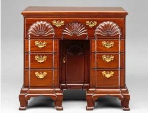
America’s design sensibilities were originally a continuation of European traditions, particularly British, French and Dutch influences depending on the region. Furniture, architecture, fashion and decorative arts largely mimicked Old World styles, from the ornate grandeur of English Baroque to the rustic simplicity of country French Provincial. This is unsurprising given that the colonies were an extension of their mother countries, reliant on them not only to import finished goods but also for cultural identity.

However, even in this early period, a distinctly American design philosophy began to emerge. Colonial craftsmen had to adapt European techniques and aesthetics to the particular resources and conditions of the New World. Native woods like pine, birch and maple replaced English oak. Regional variations evolved based on locally available materials and the unique ethnic mix of each settlement.

More importantly, the egalitarian spirit of the American project gave rise to design that favored practicality and attainability over aristocratic ornamentation. Whereas European high style was designed to showcase wealth and status, early American interiors were comparatively modest and utilitarian, reflecting the Puritan values and democratic ideals of the colonists. Clean lines, sturdy construction and an emphasis on comfort and function would come to define the American design ethic.

This is not to say colonial America was without ostentation. The homes of wealthy merchants in Boston, New York and Philadelphia boasted lavish Georgian interiors with imported English and Chinese furnishings, marking the beginnings of an upper class aesthetic distinct from the common rabble. Here we see the first stirrings of the peculiar American tension between an idolization of European high culture and a celebration of homespun pioneer ingenuity – a conflict that would shape the nation’s tastes for generations to come.

Federal Period

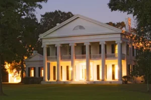
The years following the Revolutionary War saw the newly independent United States begin to more confidently assert its own national aesthetic, even as it continued to take cues from Europe. Neoclassicism, which hearkened back to the clean lines and rational proportions of ancient Greece and Rome, was the dominant style of the late 1700s on both sides of the Atlantic. In the US, this expressed itself in what we now call the Federal style.

Inspired by the democratic ideals of the fledgling republic, Federal design was a more restrained and egalitarian take on European Neoclassicism. Architects like Charles Bulfinch and Samuel McIntire adapted the stately Georgian style to a more attenuated and delicate aesthetic suited to America’s self-image as an Enlightenment nation – rational, elegant and free from excessive aristocratic trappings.

This was the age of Thomas Jefferson, the great architectural patron whose home of Monticello embodied Federal ideals. With its temple-like porticos and symmetrical façade, Monticello projected an air of classical grandeur, yet maintained a simple and efficient floorplan. Inside, Jefferson filled the rooms with cutting-edge gadgets and space-saving furniture of his own invention, marrying the spirit of democratic innovation with a reverence for antique forms.

Advances in furniture production also allowed for the growth of a uniquely American style during this period. The graceful, linear designs of New England cabinetmakers like Duncan Phyfe evolved the British Hepplewhite aesthetic in a more pared-down direction suited to mass manufacturing. The trademark “fancy chair,” with its curved back and scrolling legs, was an early success of the standardized, factory-made furniture industry that would drive American design in the coming century.

Psychologically, Federal style embodies the heady optimism and noble aspirations of the young nation. By adopting the visual language of the ancient republics, Americans sought to cast themselves as the inheritors of a grand tradition, destined to build a more perfect democratic society. At the same time, the pared-down silhouettes and efficient construction spoke to an egalitarian worldview and an embrace of innovation over tradition. If the Baroque excess of the colonial elite expressed a people still in thrall to aristocratic Europe, the Federal period marked the beginning of a distinctly American design identity.

Victorian Era

The first half of the 19th century saw a wild proliferation of revival styles in American architecture and design, reflecting a burgeoning national obsession with the romance of the past. Greek Revival mansions dotted the landscape in imitation of the newly-trendy Greek War of Independence. Gothic Revival cottages in the style of a Sir Walter Scott novel indulged a collective fantasy of misty medieval Britain. Italianate villas recalled the glory of the High Renaissance.

This eclectic jumble of historic influences was a symptom of the young nation’s search for cultural identity and legitimacy. In the absence of a long and storied history of their own, Americans borrowed from the greatest hits of Western civilization to lend an air of old-world sophistication to their surroundings. The wealthier and more prominent the household, the more important it was to show off one’s worldly taste and erudition through design.

At the same time, rapid industrialization and the growth of the middle class fueled a booming market for affordable home furnishings. Rather than the handcrafted pieces of earlier generations, these mass-produced items were often cheaply made and garishly ornamented in imitation of upper-class fashions. The Victorian parlor, with its overstuffed furniture, layers of rich fabrics, and knick-knack covered surfaces, embodied the era’s penchant for conspicuous consumption and domestic showmanship.

From a psychological perspective, the Victorian period represents a nation still unsure of its place in the world, striving to prove itself through material excess and borrowed grandeur. The flamboyant revivalist fantasies papered over deep-seated anxieties about America’s cultural and moral standing in an age of rapid change. By surrounding themselves with the trappings of respectable civilization, the upwardly mobile middle class could assuage their status anxiety and distance themselves from the nation’s rougher pioneer past.

Arts & Crafts Movement

dAs the 19th century drew to a close, a backlash emerged against both the eclectic chaos of Victorian style and the shoddy uniformity of mass production. The Arts and Crafts movement, which originated in England with thinkers like William Morris and John Ruskin, called for a return to traditional handcraft, honest construction, and design that integrated beauty with utility.

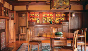
In the United States, the Arts and Crafts philosophy found its fullest expression in the bungalow architecture and Mission-style furnishings of the early 20th century. Inspired by the humble adobe dwellings of California’s Spanish missions, architects like the Greene brothers created low-slung, open plan homes with a cozy, handmade feel. Exposed ceiling beams, built-in cabinets and fireplaces, and locally-sourced materials like river rock and redwood reflected an aesthetic that was deeply attuned to nature and local traditions.

Furniture makers like Gustav Stickley became the movement’s evangelists, producing solid, practical pieces with a distinctly American sensibility. Stickley’s Craftsman line of chairs, tables and case furniture featured simple rectilinear forms, visible joinery and a celebration of the inherent beauty of natural wood grain. By stripping away inessential ornament and prioritizing functionality, Stickley and his imitators created a design language that felt both rustic and modern, rooted yet forward-looking.

Psychologically, the Arts and Crafts movement represented a collective yearning for authenticity and rootedness in a rapidly-changing world. As America hurtled towards the 20th century, propelled by unprecedented industrialization and urbanization, many felt a sense of disconnection from traditional skills and ways of life. By surrounding themselves with objects that bore the visible mark of the craftsman, people could feel they were opting out of the soulless industrial system and reconnecting with a simpler, more wholesome existence.

However, there was an inherent contradiction in the Arts and Crafts vision. For all their emphasis on handcraft and individuality, proponents like Stickley were essentially designing for mass manufacture. Their aesthetic of handmade simplicity was as much a style to be packaged and sold as the gaudy Victoriana they positioned themselves against. In this way, the movement foreshadowed the commodification of counterculture that would become a recurring theme in 20th century design.

Modernism & the Machine Age

The 1920s and 30s saw a radical break from historical revivalism and an enthusiastic embrace of modernity in all its forms. The Machine Age was in full swing, and designers sought to create objects and environments that embodied the sleek, dynamic spirit of the times. Streamlining, a concept borrowed from automotive and industrial design, became the guiding aesthetic principle, as seen in iconic works like Raymond Loewy’s locomotives and Walter Dorwin Teague’s cameras.

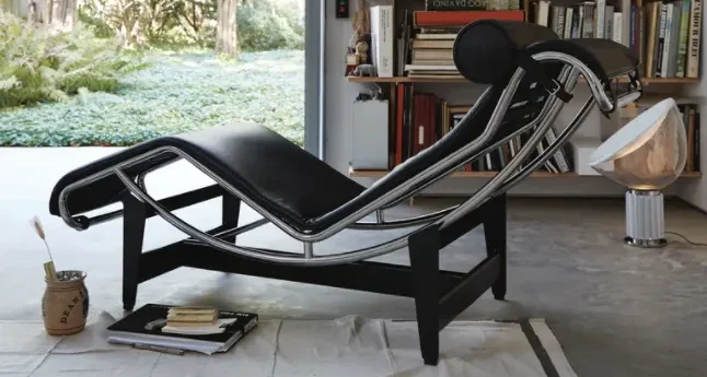
In architecture, European modernists like Walter Gropius and Mies van der Rohe introduced stark, boxy geometries and industrial materials like steel, concrete and glass. Their radically simplified International Style rejected ornament in favor of expressing the pure functionality of a building’s structure. In America, architects like Frank Lloyd Wright put a more organic spin on modernist principles, as seen in masterpieces like Fallingwater, with its bold cantilevered planes and fluid integration into the landscape.

The world of furniture design was equally transformed by modernist experimentation. Tubular steel, plywood and plastic laminate allowed for an entirely new vocabulary of curving, cantilevered forms. Marcel Breuer’s Wassily chair distilled the traditional armchair to a few tensile lines. Charles and Ray Eames’ molded plywood and fiberglass shell chairs embodied both ergonomic and manufacturing efficiency.

Psychologically, Machine Age modernism reflected a society in thrall to the possibilities of technology and industry. In a sense, it was an optimistic vision, celebrating human ingenuity and the power to reshape the material world for maximum efficiency and hygiene. The muscular geometries of skyscrapers and the aerodynamic curves of automobiles were heroic forms, symbolic of a civilization accelerating towards a brighter future.

At the same time, there was something profoundly alienating about the modernist drive toward abstraction and standardization. In rejecting historical ornament and cultural references, modernist designers were scraping away the human stories and textures that make a place feel like home. The machine aesthetic, for all its symbolic power, left little room for individuality, coziness or a sense of rootedness in the past.

The Postwar Era

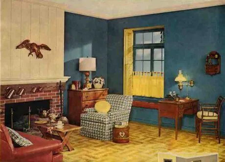
1950s Retro Nostalgia

1950s Space Age Futurism

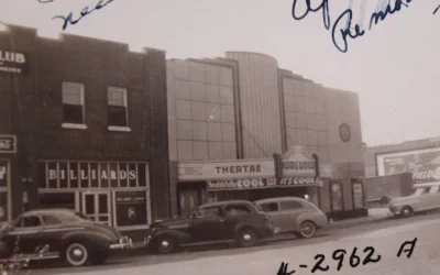
The decades after World War II saw a strange mix of modernist and historicist influences in American design. On one hand, the booming postwar economy and the rise of a prosperous middle class created demand for forward-looking, futuristic styles. On the other, the Cold War climate of anxiety and social conformity led to a nostalgic embrace of traditional domestic ideals.

In the realm of architecture, the International Style continued to dominate institutional and corporate projects, but the average American home took on a more conservative, vaguely historicist character. The explosion of cheap, mass-produced tract housing gave rise to a new template for suburban living – the California ranch house. With its low-slung profile, open floor plan and picture windows, the ranch borrowed from modernist notions of indoor-outdoor living. But its use of wood siding, shutters and decorative ironwork also nodded to a romanticized pioneer past.

This same tension between futurism and nostalgia played out in the design of everyday objects. The space age was in full swing, and Americans were obsessed with all things streamlined and science-fictional. Cars sprouted rocket-like tail fins and chrome grilles. Appliances like refrigerators and vacuum cleaners took on sleek, aerodynamic casings. Plastics and synthetic fabrics in bright, chemical hues lent an air of disposable modernity to interiors.

At the same time, there was a strong undercurrent of sentimentality and conservatism in postwar style. Kitschy colonial reproduction furniture, flowery wallpaper and ruffled chintz upholstery projected a vision of cozy, old-fashioned domesticity. Hollywood epics and historical theme parks fueled a popular fascination with romanticized visions of the past, from the antebellum South to ancient Egypt.

From a psychological standpoint, this schizophrenic mash-up of styles speaks to a society torn between excitement for the future and anxiety about the pace of change. The space age aesthetics of tail fins and Formica embodied a culture intoxicated by its own technological prowess, convinced that scientific progress would usher in a thrilling tomorrow. Yet beneath the chrome-plated optimism lurked a deep unease about the social and moral implications of modernity.

The flight to cloying, sentimental visions of home and history was a reactionary impulse, an attempt to shelter oneself from the disorienting upheavals of the age. By filling their split-level living rooms with colonial tchotchkes, postwar consumers could play act a fantasy of old-fashioned simplicity and order, even as the world outside raced headlong into an uncertain future.

The Countercultural Turn

1960s Color

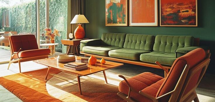
1970s Earth Tones

The cultural rebellions of the 1960s and 70s brought a whole new set of values and aesthetics to the fore of design. Across the Western world, a generation raised in prosperity and shaped by the anti-authoritarian spirit of the counterculture was coming of age. Their ideas about what constituted good design were far removed from the sleek consumerist futurism of their parents’ generation.

The hippie ideal of getting “back to the land” manifested in a revival of crafty, folksy styles that hearkened back to preindustrial traditions. Macramé wall hangings, hand-thrown pottery, embroidered textiles and rough-hewn wood furniture projected an earthy, handmade vibe. Earth tones like harvest gold, avocado and burnt sienna dominated color palettes, in contrast to the cool blues and whites of mid-century modern.

At the same time, advances in manufacturing and materials science were giving rise to new design possibilities that meshed well with countercultural sensibilities. Plastic furniture in fluid, biomorphic forms reflected a more organic and experiential approach to interiors. Inflatable seating, paper dresses and other cheap, ephemeral products captured the playful, disposable spirit of youth culture.

Psychedelic graphics and blacklight posters brought the mind-bending visual language of drug culture into the mainstream. With their swirling ornamental motifs and clashing colors, these designs sought to capture the hallucinatory intensity and mystical spirituality of the psychedelic experience. By surrounding themselves with such self-consciously “trippy” imagery, consumers could signal their tuned-in, dropped-out lifestyle.

Beneath these diverse trends ran a common thread: a rejection of the rationalist, materialist values of the postwar order and an embrace of more intuitive, experiential modes of being. For a youth culture steeped in existentialist philosophy and Eastern mysticism, design was no longer about imposing scientific order on the world, but about tuning into the organic flows and cosmic rhythms of nature. The earthy, handcrafted aesthetics and swirling psychedelic motifs were an attempt to re-enchant a world that had been drained of meaning by technocratic rationality.

Of course, the great irony of the countercultural design revolution is how quickly it was co-opted by the very consumerist system it claimed to reject. By the mid-70s, the trappings of hippie style had been thoroughly commodified, churned out in mass-produced form by the big retail brands. The anti-materialist values of the counterculture proved remarkably easy to repackage as a materialist lifestyle, one that could be bought into with the right throws pillows and wall art.

This tension between rebellion and cooptation would come to define the design landscape of the late 20th century. Even as subcultures continued to arise with their own transgressive visual languages, the mechanisms of consumer capitalism found ever more sophisticated ways to absorb and neutralize them. The distance between the authentic and the mass-produced, the cool and the sellout, grew harder and harder to define.

Postmodernism & the Digital Age
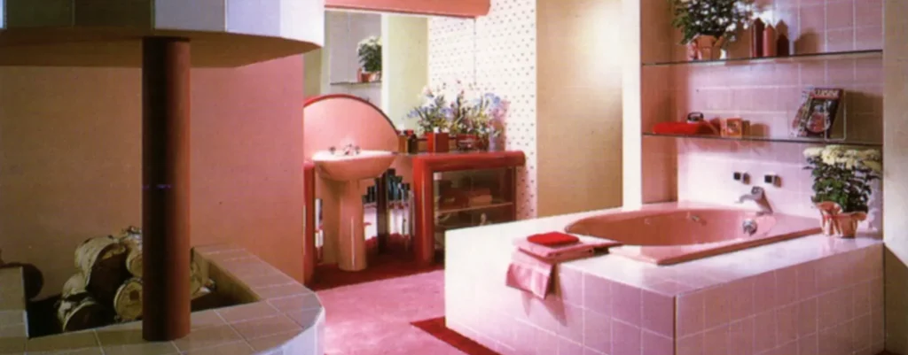
The 1980s marked the beginning of a new cultural paradigm, one defined by a skepticism towards grand narratives and a playful embrace of surface over substance. Postmodernist thinkers challenged the very notion of a singular, universal Truth, arguing that meaning was always contingent on cultural context. In the realm of design, this translated into an eclectic, irreverent attitude that freely mixed historical references, pop culture cliches and ironic self-awareness.

Architects like Robert Venturi and Michael Graves pioneered a new approach that rejected the austerity of modernist glass boxes in favor of witty, decorative facades that nodded to classical and vernacular traditions. Philip Johnson’s AT&T building, with its Chippendale-inspired broken pediment, became an icon of the style. Interiors grew more theatrical and scenographic, filled with knowingly kitschy historical reproductions and audaciously patterned fabrics.

The explosion of digital technology in the 1990s added a new futuristic overlay to the postmodernist mélange. Translucent iMacs in candy colors and proto-smartphones with alien form factors captured the techy optimism of the early internet age. Pixelated graphics and glitchy, low-res aesthetics infiltrated fashion and branding, telegraphing a fascination with the strange new textures of cyberspace.

At the same time, a strain of techno-utopianism emerged that sought to revive the heroic purity of mid-century modernism for the digital age. Sleek, monochromatic gadgets with seamless user interfaces reflected a fantasy of friction-free global connectivity. Open plan office spaces filled with Frank Gehry chairs and Jeff Koons balloon animals projected an air of disruptive innovation and frictionless collaboration.

Psychologically, the postmodern era reflects a culture grappling with the fragmenting effects of an incipient information revolution. In a world where global communication networks were beginning to erode traditional notions of time, space, and identity, design became a way to navigate the disorientation. By sampling freely from history and remixing it with the frenetic pace of digital life, postmodern style enacted the vertiginous experience of a society in flux.

The ironic detachment and self-referentiality of the period can also be seen as a coping mechanism for a generation raised on media saturation and advertising overload. Having grown up with the relentless commodification of the counterculture, savvy consumers had become adept at decoding the hidden social programming behind designed objects. Postmodern style allowed them to signal their sophistication by consuming with a wink, participating in consumer culture while seeming to hover above it.

Contemporary Currents

reclaimed industrial space
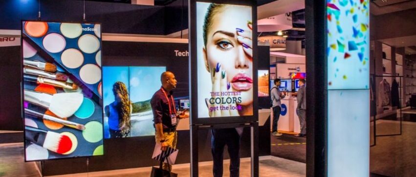
 

dematerialized digital design

In the first decades of the 21st century, the pace of technological and cultural change has only accelerated, leading to a design landscape that feels increasingly fractured and difficult to define. The sheer volume and velocity of visual information circulating across global digital networks has collapsed the cycle of trends and movements to a matter of weeks or even days. Microtrends arise and evaporate with bewildering speed, as social media platforms enable niche aesthetics to find viral popularity overnight.

One overarching development has been the increasing “dematerialization” of design in the digital age. As more and more of life is mediated through screens, physical objects have lost some of their primacy as carriers of cultural meaning. Ephemeral, experiential modes of design like UX, UI, social media aesthetics and emoji usage have become key arenas where cultural values and identities are negotiated.

This is not to say that physical design has become irrelevant. If anything, the bodily experience of materiality has taken on a new aura of authenticity and luxury in an increasingly virtual world. “Artisanal” and “bespoke” have become buzzwords, as consumers seek out handcrafted, one-of-a-kind objects as an antidote to digital flatness. Rough-hewn, organic materials like live-edge wood and hand-thrown ceramics tap into a desire for tactility and rootedness.

At the same time, concern over climate change and resource scarcity has given rise to a new wave of ecological design thinking. Architects and product designers are increasingly focused on creating objects and environments that are sustainable, biodegradable, and harmoniously integrated with natural systems. Biomimicry, modular construction, and closed-loop manufacturing reflect an ethos of “cradle-to-cradle” design that rejects the linear model of extraction and waste.

On a psychological level, the diversity and speed of contemporary design trends reflects a culture grappling with a crisis of meaning in the face of dizzying change. In a world where identities are fluid, information is suspect, and the future feels precarious, design has become a way to ground oneself in a fleeting present. For some, this means embracing the hyper-ephemeral, meme-driven churn of digital style as a kind of absurdist play. For others, it means seeking out objects and experiences that feel timelessly authentic, rooted in primal sensory pleasures and age-old crafts.

In this context, the role of the designer has become at once more challenging and more vital than ever. In a sea of endless and often cynical commercial messaging, there is a hunger for design that feels genuinely meaningful and humane. This requires a deep understanding of the emotional and cultural resonances that objects can carry, as well as a commitment to creating things that enrich rather than exploit our common life.

As we look to the future, it’s clear that the pace of change will only continue to accelerate. Technologies like AI, VR/AR, and the internet of things promise to further blur the line between the digital and physical, the real and the virtual. In the face of such upheaval, the role of designers will be to find ways to anchor us in our embodied humanity, to craft objects and experiences that stimulate our senses, tell meaningful stories, and connect us to one another and the living planet we share. In an age of distraction and dislocation, good design may be our best hope for finding beauty, meaning and belonging in the here and now.

What’s the Future of the Psychology of Design?

Looking back over three centuries of American design, we see a culture in constant tension between the allure of progress and a longing to anchor itself in bedrock values. From the democratic restraint of 18th century Federal style to the earthy vibes of 1970s macramé, each era’s aesthetic proclivities reflect the deeper psychological currents of the age.

Consistently, moments of dizzying technological and social upheaval have given rise to design movements that seek to return to a sense of authenticity and rootedness. Whether in the form of the handcrafted simplicity of the Arts & Crafts era or the rustic materials and natural shapes of 1970s environmental design, aesthetic responses to modernity have often hinged on a rejection of cheap, mass-produced superficiality in favor of sensual and spiritual anchors.

At the same time, American design has consistently reflected a restless fascination with novelty, an almost utopian faith in the power of human ingenuity to reshape the world. From the gee-whiz machine forms of 1930s streamline moderne to the candy-colored translucence of 1990s iMac futurism, each generation has found ways to aestheticize its era’s most exciting new materials, technologies and lifestyles.

This creative tension, between the timeless and the cutting-edge, the organic and the manufactured, the rustic and the sophisticated, is in many ways the defining dialectic of American culture. It speaks to a national psyche caught between a reverence for the frontier spirit and a yearning for cosmopolitan refinement, a rugged individualism and a hunger for communal belonging.

As we move deeper into the 21st century, these tensions show no sign of resolving. If anything, the pace of technological change and social upheaval seems poised to accelerate, challenging designers to find ever more thoughtful and emotionally relevant ways to shape the material world. The objects we surround ourselves with will continue to reflect our deepest hopes and fears, our kneejerk responses and considered values, our nostalgic longings and boldest visions of the future.

In this endless balancing act between the past, present and future, one thing remains constant: the vital role of beauty and craft in anchoring us to our humanity. In an age of virtual abstraction and consumerist churn, the work of designers will be to create objects and environments that stimulate our senses, tell nourishing stories, and facilitate genuine human connection. Armed with a sensitive understanding of history, culture and psychology, the designers of tomorrow can help lead us towards a material world that feels richer, truer and more meaningful than ever.


Walter Ong: Orality, Literacy, and the Jesuit Worldview

Walter Ong: Orality, Literacy, and the Jesuit Worldview

I. Who was Walter Ong Walter J. Ong (1912-2003) was an American Jesuit priest, professor of English literature, and cultural and religious historian. Ong made groundbreaking contributions to the fields of literacy studies, media ecology, and the evolution of human...

0 Comments

Submit a Comment

Your email address will not be published. Required fields are marked *