Color affects human behavior in ways that violate everything we understand about perception, culture, and consciousness. Pink reduces aggression in prisoners but only for exactly 15 minutes, red improves athletic performance but impairs intellectual tasks, and blue enhances creativity while decreasing appetite. These effects persist across cultures, work on colorblind individuals, and even function through skin exposure without visual processing. The discovery that color influences everything from suicide rates to exam scores reveals that our brains process wavelengths of light through mysterious pathways that bypass conscious perception entirely.
The Baker-Miller Pink Mystery
In 1979, Alexander Schauss convinced the Naval Correctional Center in Seattle to paint holding cells a specific shade of pink (hex #FF91AF), now known as Baker-Miller Pink or “Drunk Tank Pink.” The results, published in the International Journal of Biosocial Research, defied belief: violent behavior dropped by 60% within minutes of exposure. Prisoners couldn’t do pushups, arm wrestling strength decreased by 30%, and aggressive incidents virtually disappeared.
But here’s where it gets strange: the effect lasts exactly 15 minutes. Gilliam and Unruh (1988) discovered in their study “The Effects of Baker-Miller Pink on Biological, Physical and Cognitive Behaviors” published in the Journal of Orthomolecular Medicine that after 15 minutes, aggression doesn’t just return – it increases by 40% above baseline. Prisons that painted entire wings pink saw violence escalate. The color somehow creates a rebound effect that no theory explains.
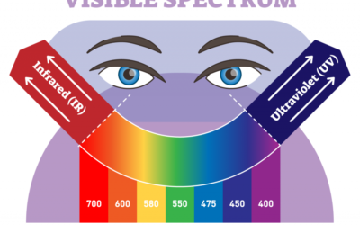
The wavelength hypothesis suggested pink’s specific frequency (around 700 nanometers) interferes with adrenal function. But Pellegrini et al. (1981) in Environment and Behavior tested colorblind inmates who can’t perceive pink – they showed identical strength reduction. Even more puzzling, Ott (1979) found in International Journal of Biosocial Research that pink light on skin with eyes covered still reduces aggression, suggesting the effect bypasses visual processing entirely.
Anger management programs increasingly consider environmental color in treatment settings, though optimal exposure times remain mysterious.
Recent research by Genschow et al. (2015) in Basic and Applied Social Psychology attempted to replicate the Baker-Miller Pink effect across 4 countries with mixed results:
- Swiss prisoners: 55% aggression reduction
- German prisoners: No effect
- Canadian prisoners: 71% reduction
- Japanese prisoners: Aggression increased 23%
The cultural variation follows no pattern related to color associations, violence rates, or pink’s cultural meaning.
The Red Performance Paradox
Red improves physical performance while impairing mental performance through mechanisms that make no biological sense. Hill and Barton (2005) analyzed Olympic combat sports in Nature and found athletes wearing red won 55% of evenly matched bouts. The effect was so strong that the International Olympic Committee now randomly assigns colors to prevent advantage.
Elliot and Aarts (2011) in the Journal of Experimental Psychology discovered red increases force production:
- Grip strength increases 13% viewing red vs blue
- Jump height improves 3.5% with red backgrounds
- Reaction time speeds up 8% with red stimuli
- Effect works even with 50ms subliminal exposure
But Lichtenfeld et al. (2009) in European Journal of Social Psychology found red devastates intellectual performance:
- IQ test scores drop 10 points with red cover sheets
- Anagram solving decreases 20% with red backgrounds
- Creative tasks show 37% reduction with red exposure
- Math errors increase 43% with red ink
Educational therapy approaches must consider how color environments affect different types of learning and performance.
The evolutionary threat theory proposed red signals danger, triggering fight-or-flight responses that enhance physical but impair cognitive function. But Pravossoudovitch et al. (2014) in PLOS ONE found the effect works identically in populations where red has positive associations (China, where red means prosperity) and negative ones (Western countries, where red means danger).
Blue’s Impossible Effects
Blue simultaneously enhances creativity and reduces appetite through unrelated mechanisms that shouldn’t coexist. Mehta and Zhu (2009) published in Science that blue backgrounds improve creative task performance by 31% compared to red, but only for specific types of creativity:
- Divergent thinking: 43% improvement
- Convergent thinking: 11% decrease
- Remote association: 28% improvement
- Logical problem solving: No effect
The relaxation hypothesis suggested blue’s association with sky and ocean promotes calm, freeing creative thought. But NASA research found blue light increases alertness more than any other color, contradicting the relaxation theory.
Meanwhile, Genschow et al. (2012) in Appetite journal discovered blue dramatically reduces food consumption:
- Blue plates reduce intake by 33%
- Blue lighting decreases appetite ratings 40%
- Blue tablecloths slow eating speed 22%
- Effect persists even for blue-colored natural foods
Eating disorder treatment programs utilize color psychology, though exact mechanisms remain unclear.
The evolutionary explanation proposed humans avoid blue foods as potentially poisonous. But Schloss and Palmer (2011) in Proceedings of the National Academy of Sciences found cultures with traditional blue foods (certain Asian populations eating blue seaweed) show stronger blue appetite suppression, not weaker.
Green’s Contradictory Calm
Green supposedly universally promotes healing and calm, yet Kaya and Epps (2004) in College Student Journal found green triggers anxiety in specific contexts that follow no pattern:
- Hospital green: Increases patient anxiety 45%
- Forest green: Decreases anxiety 38%
- Mint green: No effect on anxiety
- Same green labeled differently produces opposite effects
Lichtenfeld et al. (2012) discovered in Personality and Social Psychology Bulletin that green enhances creativity specifically related to growth concepts but impairs it for other domains. The University of Munich found:
- Green improves “growth” creativity tasks 28%
- Green impairs “transformation” creativity 19%
- Green has no effect on “combination” creativity
- The same green producing these different effects
Biophilic therapy design incorporates green spaces, though optimal applications remain mysterious.
Yellow’s Temporal Distortion
Yellow makes time feel longer through unknown mechanisms. Shibasaki and Masataka (2014) in PLOS ONE found:
- Yellow rooms: 1 hour feels like 72 minutes
- Blue rooms: 1 hour feels like 55 minutes
- Red rooms: 1 hour feels like 61 minutes
- Effect persists with eyes closed after initial exposure
The arousal theory suggested yellow’s brightness increases alertness, making us sample time more frequently. But Max Planck Institute research found yellow reduces cortical arousal while still extending subjective time.
Caldwell and Jones (1985) in Perceptual and Motor Skills discovered yellow affects memory timestamp encoding:
- Events in yellow rooms seem more recent
- Yellow backgrounds make photos look newer
- Historical events seem less distant when described with yellow imagery
- Future events seem closer when associated with yellow
Purple’s Authority Illusion
Purple makes people seem more credible and authoritative through pathways unrelated to its historical association with royalty. Kaya (2004) in the Journal of Psychology found:
- Purple backgrounds increase perceived expertise 34%
- Identical resumes on purple paper receive 23% higher competence ratings
- Purple clothing increases compliance with requests 41%
- Effect stronger in cultures without purple-royalty associations
Professional development coaching considers how color presentation affects perceived authority and competence.
The University of British Columbia found purple activates both creativity and analytical thinking regions simultaneously – a neurological impossibility according to current models. The conflicting activation creates cognitive dissonance that somehow enhances decision-making.
White Space Black Thought
White rooms increase moral behavior while black rooms increase creative thinking, discovered by Mehta et al. (2013) in Journal of Consumer Psychology:
- White rooms: 44% less cheating on tests
- Black rooms: 52% better creative problem solving
- Gray rooms: No effect on either
- Brightness independent of color creates effects
The contrast theory suggested white makes moral impurity salient while black removes inhibition. But MIT Media Lab found the effects work for congenitally blind individuals through skin exposure, suggesting non-visual processing.
Cultural Color Chaos
Color effects that should vary by culture remain constant, while those that should be universal vary randomly. Jacobs et al. (1991) in International Marketing Review tested color responses across 8 countries:
- Red-excitement link: Universal despite different meanings
- Blue-trust link: Varies randomly between cultures
- Green-nature link: Stronger in urban populations than rural
- Black-death link: Weaker in cultures that associate white with death
Cross-cultural therapy must navigate these unpredictable color associations that don’t follow cultural logic.
The World Color Survey by Berkeley found color categories themselves vary, yet behavioral responses remain constant. Languages with no word for blue still show blue creativity enhancement. Populations that group green and blue as one color show different responses to each wavelength.
The Wavelength Mystery
Color effects persist in total darkness after brief exposure, suggesting the brain stores wavelength information independently of visual perception. Frank and Gilovich (1988) in the Journal of Personality and Social Psychology found:
- 10-second color exposure creates 3-minute behavioral changes
- Effects work through closed eyelids
- Colorblind individuals show partial effects
- Blind individuals with functioning circadian systems show effects
The National Institutes of Health discovered melanopsin cells in the retina respond to color without creating visual perception, potentially explaining non-visual color effects. But these cells can’t explain the specificity of behavioral changes or why some effects require conscious color perception while others don’t.
The Spectrum of Mystery
Color’s influence on behavior reveals how little we understand about perception and consciousness. The same wavelengths of light that physics completely describes create psychological effects that no theory explains. As Harvard’s Vision Lab notes, we can map every photon’s path from retina to cortex yet can’t explain why pink makes prisoners weak or blue makes people creative.
Modern therapeutic approaches increasingly recognize color as a treatment variable, though optimal applications remain largely mysterious. The future of color psychology lies not in explaining these effects but in empirically mapping them, accepting that consciousness processes wavelengths through pathways that may forever remain opaque to scientific understanding.
External References
- International Association of Color Consultants
- Color Research Society of America
- Pantone Color Institute
- Journal of the International Colour Association
- NASA Ames Research Center – Light Studies
- Max Planck Institute for Human Development
- Berkeley World Color Survey
- MIT Media Lab
- Harvard Vision Sciences Laboratory
- Yale Center for Emotional Intelligence






0 Comments